Designing Intuitive Dashboards Data Accessible and Actionable

Overview:
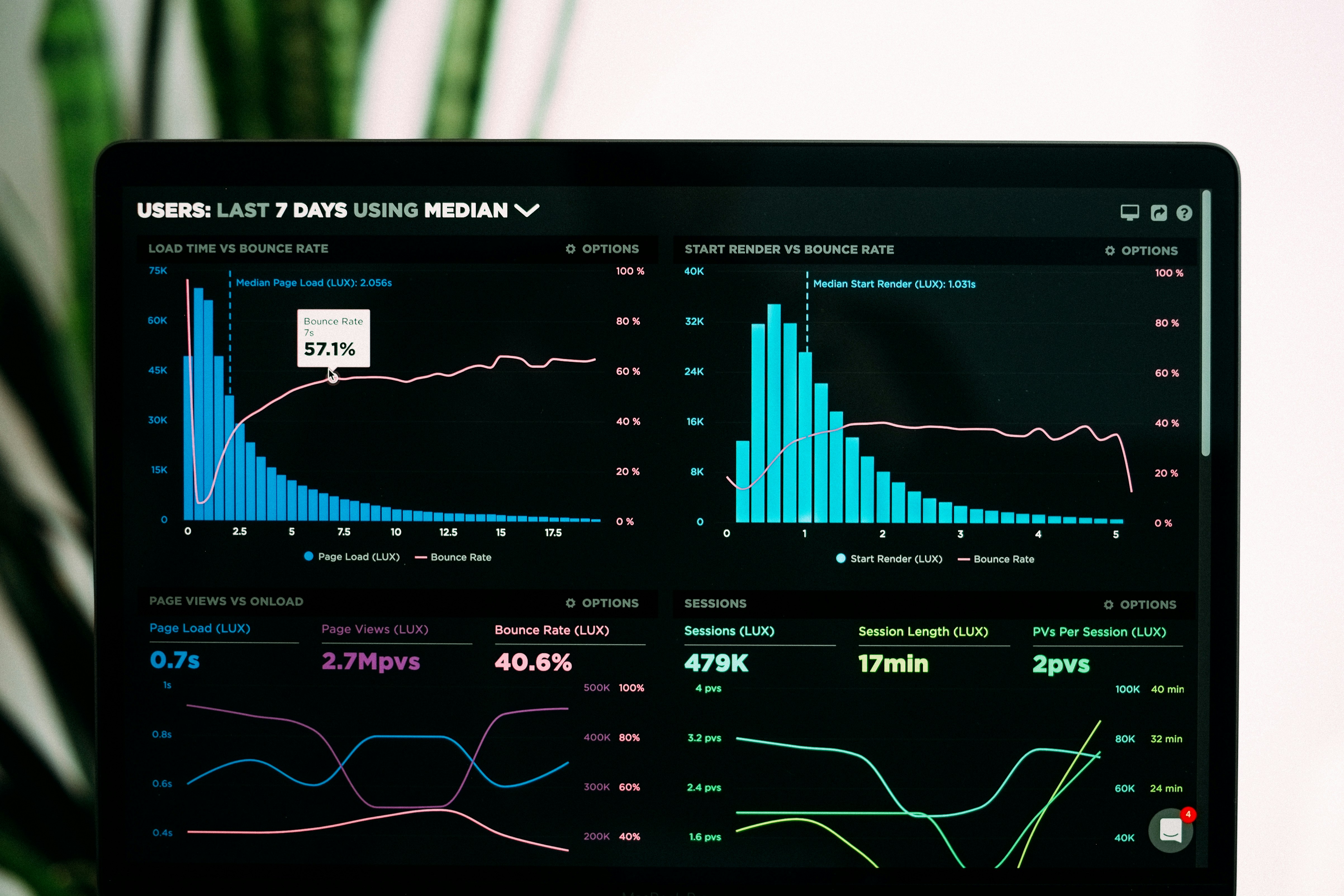
Designing Intuitive Dashboards Data Accessible and Actionable design project focused on transforming complex data into accessible, user-friendly, and actionable insights. The goal is to create dashboards that not only display data but allow users to engage with and extract meaningful information effortlessly. By focusing on user-centric design principles, Mebids makes data visualization intuitive, empowering users to make informed decisions without feeling overwhelmed.
Objective:
To design a dashboard that simplifies complex datasets, ensuring that key metrics are easy to understand and navigate. It aims to create an experience that prioritizes clarity, efficiency, and user engagement, enabling users to take immediate action based on real-time insights.
Design Approach:
The design process starts with understanding the user’s needs and workflows. Through extensive research and collaboration, we identify the critical metrics and data points that need to be front and center. The interface is designed to provide seamless navigation, with clear data visualizations, intuitive filters, and dynamic elements that respond to user interactions.
It uses a clean, minimal design approach that avoids unnecessary clutter, ensuring users can focus on what matters most. Data is presented in digestible formats, such as charts, graphs, and tables, with interactive features that allow users to drill down into specific data points for deeper insights. We also integrate customizable widgets to ensure that users can personalize their dashboards based on their preferences.
Features Explored:
Real-Time Data Updates: Delivering live data streams and updates that provide users with up-to-the-minute insights.
Customizable Dashboards: Users can personalize their interface, choosing which metrics and widgets to display.
Data Drill-Downs: Offering users the ability to click into specific data points for a deeper understanding.
Actionable Insights: Highlighting key takeaways and recommendations based on the data, helping users make quick decisions.
Interactive Data Visualizations: Engaging charts, graphs, and maps that allow users to interact and explore data in a meaningful way.
Visual Style:
It adopts a modern, minimalist aesthetic, focusing on clean lines, subtle color schemes, and clear typography. The design prioritizes readability and ease of navigation, ensuring that data can be interpreted at a glance. Thoughtful use of color helps highlight key data points, while interactive elements provide smooth transitions and seamless interactions.
Overview:
Designing Intuitive Dashboards Data Accessible and Actionable design project focused on transforming complex data into accessible, user-friendly, and actionable insights. The goal is to create dashboards that not only display data but allow users to engage with and extract meaningful information effortlessly. By focusing on user-centric design principles, Mebids makes data visualization intuitive, empowering users to make informed decisions without feeling overwhelmed.
Objective:
To design a dashboard that simplifies complex datasets, ensuring that key metrics are easy to understand and navigate. It aims to create an experience that prioritizes clarity, efficiency, and user engagement, enabling users to take immediate action based on real-time insights.
Design Approach:
The design process starts with understanding the user’s needs and workflows. Through extensive research and collaboration, we identify the critical metrics and data points that need to be front and center. The interface is designed to provide seamless navigation, with clear data visualizations, intuitive filters, and dynamic elements that respond to user interactions.
It uses a clean, minimal design approach that avoids unnecessary clutter, ensuring users can focus on what matters most. Data is presented in digestible formats, such as charts, graphs, and tables, with interactive features that allow users to drill down into specific data points for deeper insights. We also integrate customizable widgets to ensure that users can personalize their dashboards based on their preferences.
Features Explored:
Real-Time Data Updates: Delivering live data streams and updates that provide users with up-to-the-minute insights.
Customizable Dashboards: Users can personalize their interface, choosing which metrics and widgets to display.
Data Drill-Downs: Offering users the ability to click into specific data points for a deeper understanding.
Actionable Insights: Highlighting key takeaways and recommendations based on the data, helping users make quick decisions.
Interactive Data Visualizations: Engaging charts, graphs, and maps that allow users to interact and explore data in a meaningful way.
Visual Style:
It adopts a modern, minimalist aesthetic, focusing on clean lines, subtle color schemes, and clear typography. The design prioritizes readability and ease of navigation, ensuring that data can be interpreted at a glance. Thoughtful use of color helps highlight key data points, while interactive elements provide smooth transitions and seamless interactions.
Result:
It redefines the way dashboards are used by making complex data accessible and actionable. By focusing on user experience and intuitive design, we create tools that help users stay informed, make quick decisions, and interact with data in ways that feel natural. The end result is a dashboard that turns data into a powerful resource, driving better outcomes and ensuring that users can stay focused on what matters most.
Related Works


Inspiration, Straight to Your Inbox
Fresh ideas, tips, and stories delivered weekly to spark creativity and motivation.
Inspiration, Straight to Your Inbox
Fresh ideas, tips, and stories delivered weekly to spark creativity and motivation.
Inspiration, Straight to Your Inbox
Fresh ideas, tips, and stories delivered weekly to spark creativity and motivation.